...
- Cloud9
- Facebook
- Overview
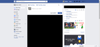
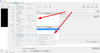
- It has 9 choices: homepage (via the logo), search, your profile, the homepage (again), pending friend requests / suggested friends, private messages, notifications, privacy shortcuts, and a small button that produces a dropdown for advanced stuff like settings, dealing with pages, groups, ads, logging out(!), and help.
- Logo:
- Interestingly, rather than spell out the name of the site, it just has the 'f' logo. But next to it, in the search box, it says 'Search Facebook' instead of just 'Search'.
- Overview
- Hubspot
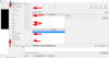
- Note how they have just one bar, with the navigation items in-line with the Hubspot logo, search bar, and user profile.
- The navbar is black. Is that to visually-separate it from the browser navbar?
- Origami Simulator
- SourceTree
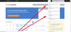
- Note how the top menu-bar is narrow, like a typical desktop application, but the menu-bar beneath it is wide, like a web app.
- It seems like the heuristic they're using is, "Things which users are going to be clicking more frequently should be easier to click. Things which users will be looking for more frequently should be easier to find."
- Also note how, because it's a desktop application, they can't have the "File, etc." menu-items up at the very-top, in-line with the logo. So there's a lot of dead space in the top bar.
- On the other hand, Chrome does have that:
 So it seems to be possible.
- On the other hand, Chrome does have that:
- They never go more than two levels deep on the menu items, and I only saw three menu-items that had a second level.
- I'm not sure what the reasoning was for having the dead-space directly underneath the menu name.
- It seems pretty clear that the horizontal lines are intended to visually-group related options.
- StackExchange
- Overview
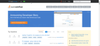
- There are only 5 buttons and a 'Search' box, so 6 total choices.
- As with Hubspot, the navbar is black. I'm guessing that's to visually-distinguish it from the browser navbar.
- Search box:
- There's no 'click-to-search' button. You have to press 'Enter' to search.
- Profile button:
- The user's profile image shows up in the navbar, which I guess lets the user know at-a-glance that they're logged in.
- 'help' button:
- Interestingly, one of the few things on the navbar is a 'help' dropdown.
- It has 5 options.
- Overview
...