...
- Don't just have the text of your nav elements clickable; make a rectangular section of the navbar (including above and below the text, and with some padding on the side) clickable.
- Examples
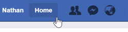
- Facebook
- Nomad List
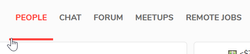
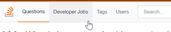
- Stack Overflow
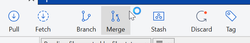
- Sourcetree
- Facebook
- Examples
- If you're using a flat color for your navbar, consider adding a single pixel line at the bottom (or a 0.1vh) of it that's just a little darker, to make it look a little 3D.
Articles / Videos
- 2015.08.24 - Web Designer Depot - The UX Case Against the Home Button
- Summary:
- It's easier for users to scan the navbar and understand the major sections of the website if there's one less option ("Home").
- Users can easily navigate the average website without it.
- It has become standard to make the company’s logo clickable.
- TODO: Finish this.
- Summary:
- 2017.02.13 - Stack Overflow - Top Navigation Update
- 2017.02.14 - Stack Overflow - How Stack Overflow Redesigned the Top Navigation
- 2017.09.20 - Stack Exchange Apps - Stack Exchange Top Nav Choices
...